Oddy Knocky
Brand Creation / Naming / Strategy / Visual Identity / Brand Fundamentals / Packaging / Website
Boldly brewing a new-to-world coffee brand
We love nothing more than creating new brands from scratch. Or in this case, from the grounds up.
In a world that can sometimes take itself too seriously, our aim was to create an antidote to all those cheerless chin-strokey coffee brands trying to pitch themselves exclusively at hard-boiled hipsters. And so, Oddy Knocky was born, to brew in the face of boring.
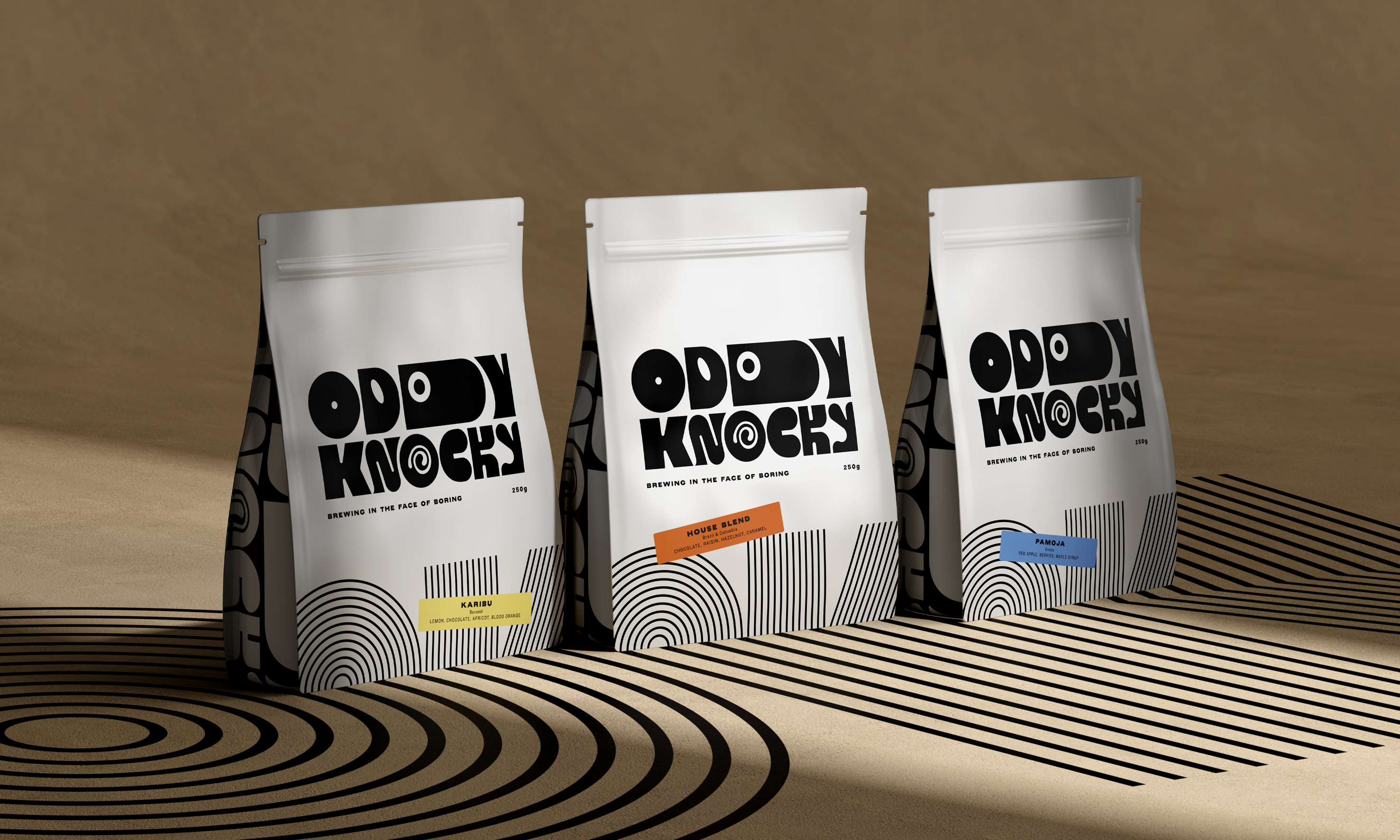
The term ‘Oddy Knocky’ may sound familiar to those of you who’ve seen A Clockwork Orange. It forms part of Nadsat, the film’s fictional slang, but its true origins actually stem from Russian. In essence, it means to ‘go on one’s own’ or ‘to be independent’ and so, when coupled with ‘coffee’ for a nice touch of alliteration, it was the standout choice after some rigorous, caffeine-fuelled naming exploration.
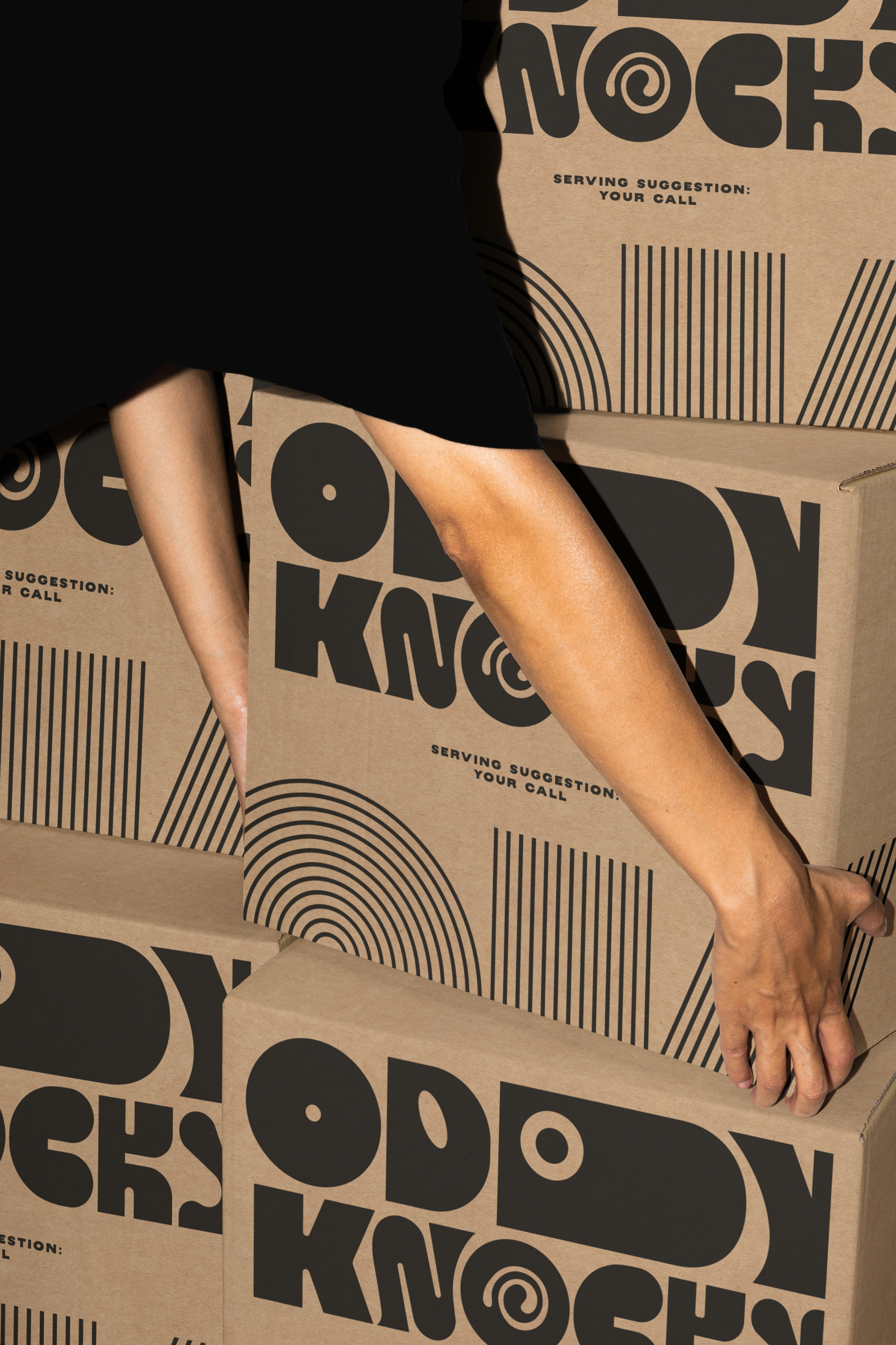
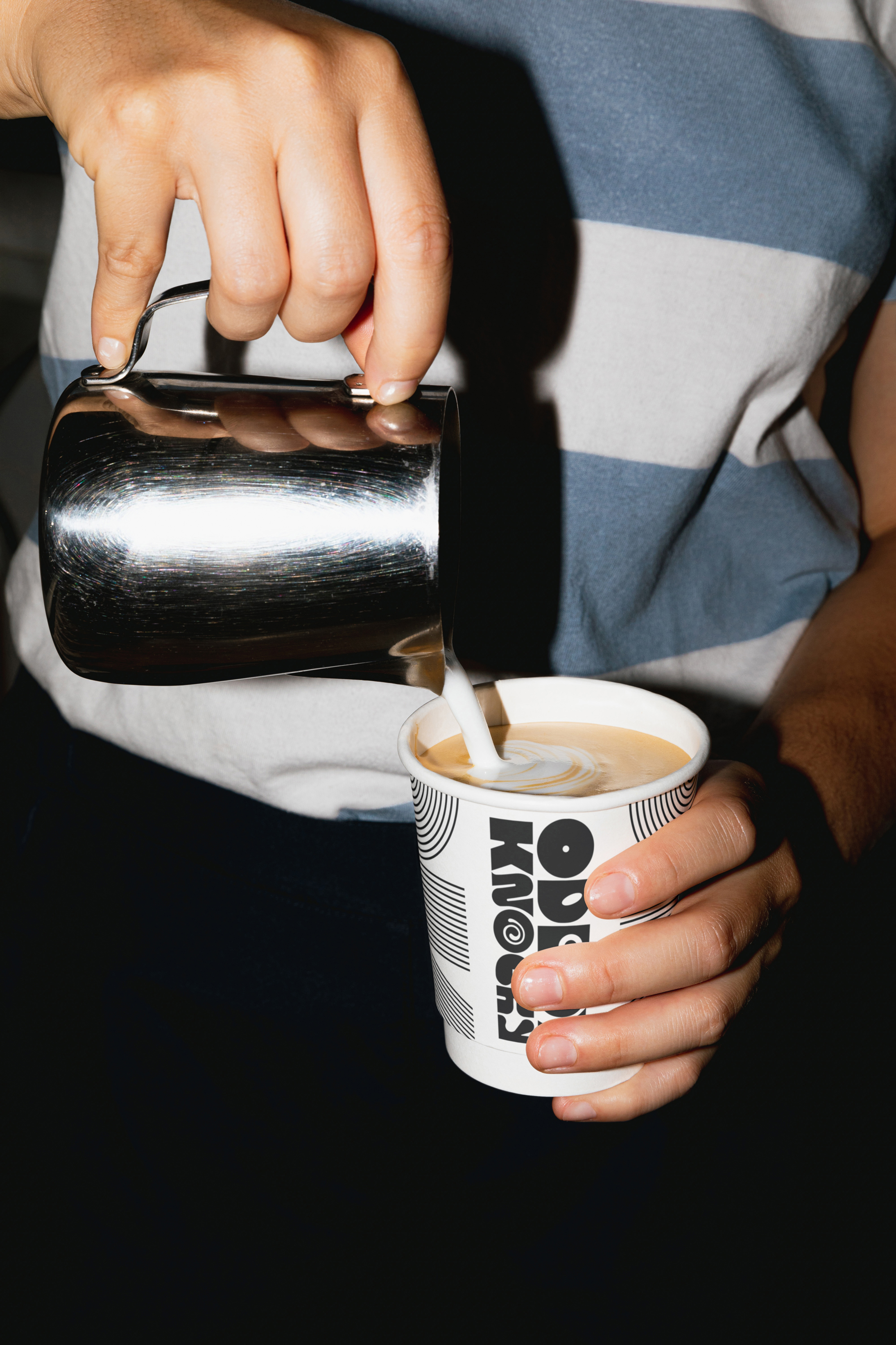
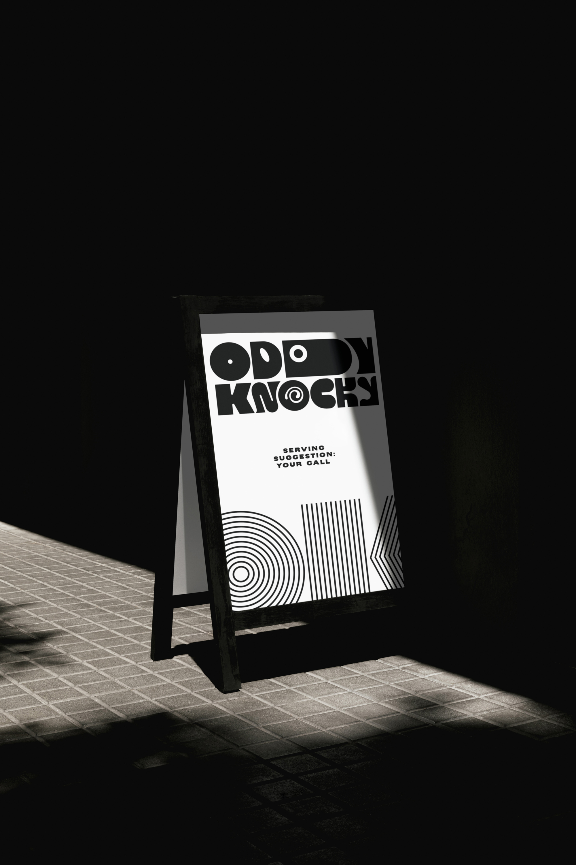
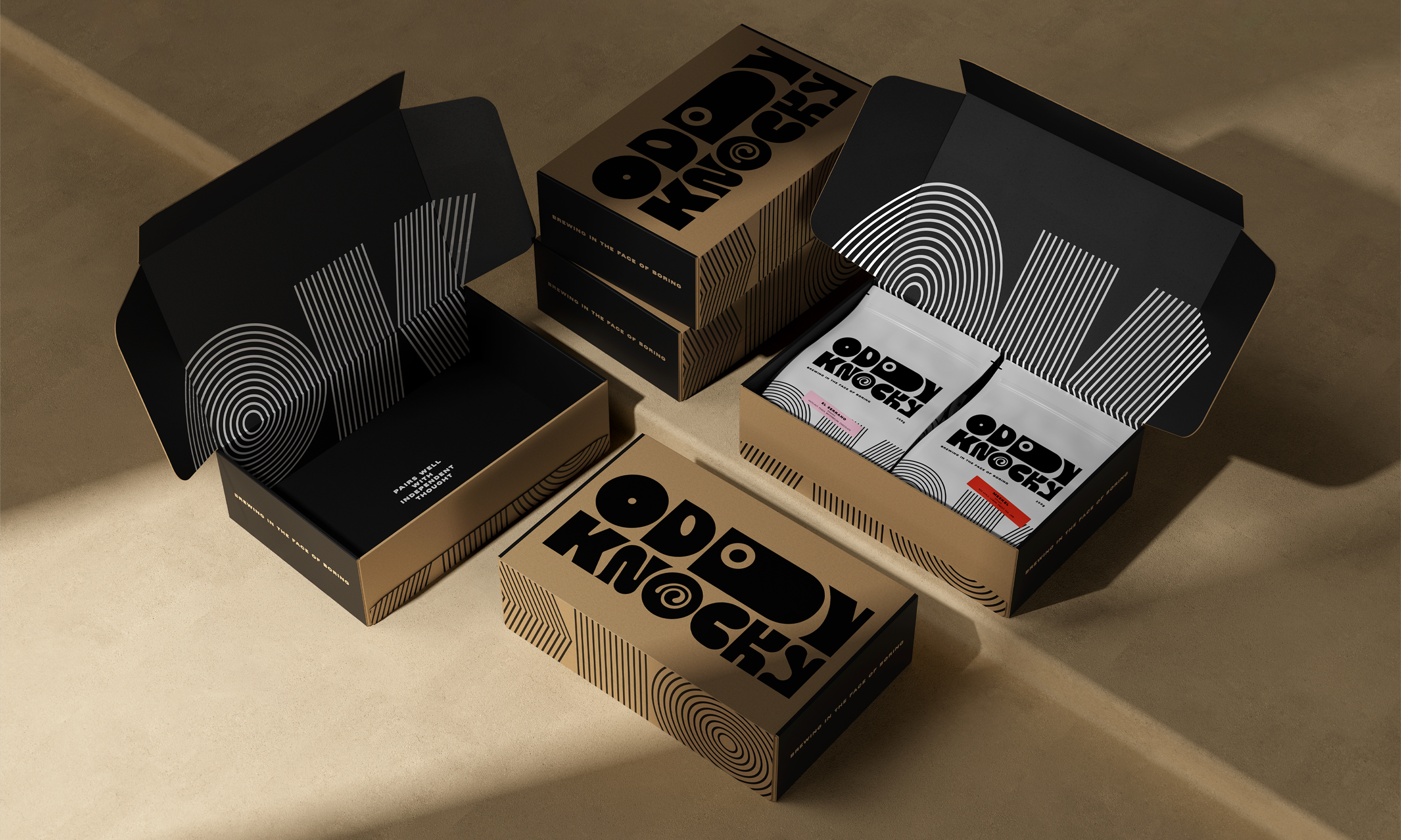
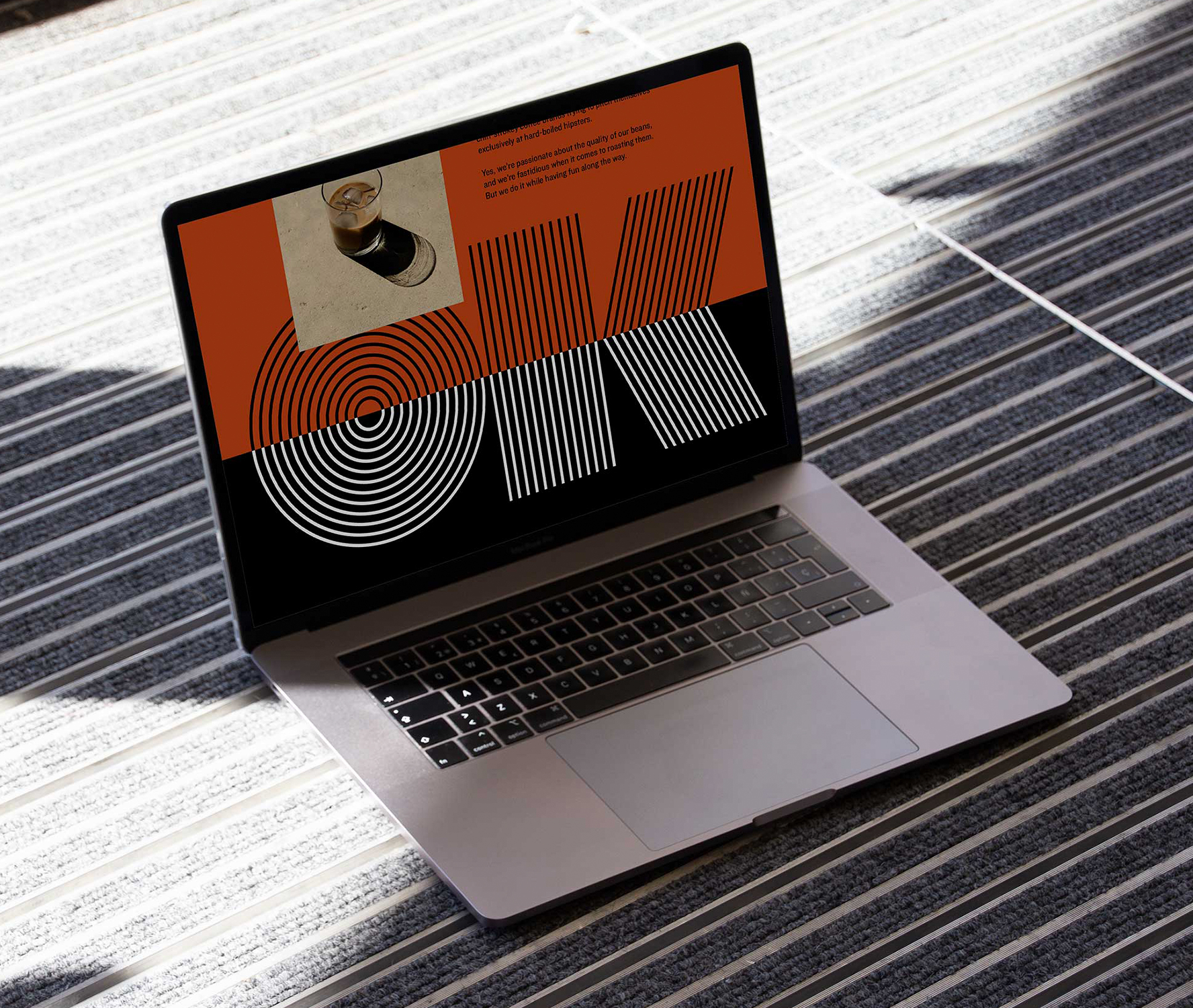
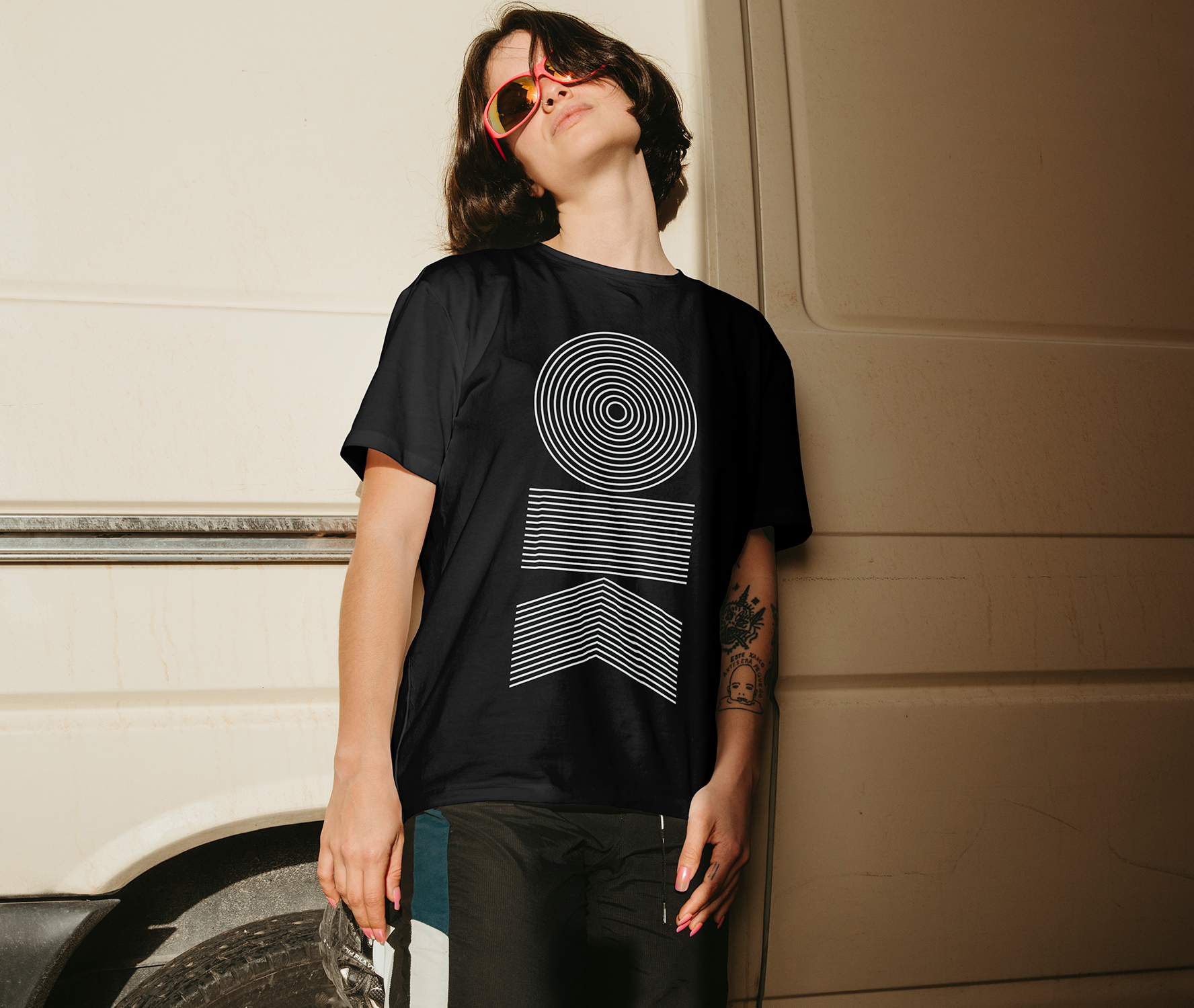
Our custom typeface uses bold letterforms that evoke a retro feel; exaggerated, eye-catching, and with a hint of coffee swirl. The colour palette brings even more personality, albeit playing into more premium cues. Black and white with occasional pops of orange paying homage to brand name origins, and brighter hues used sparingly on the stickers to highlight the different blends.
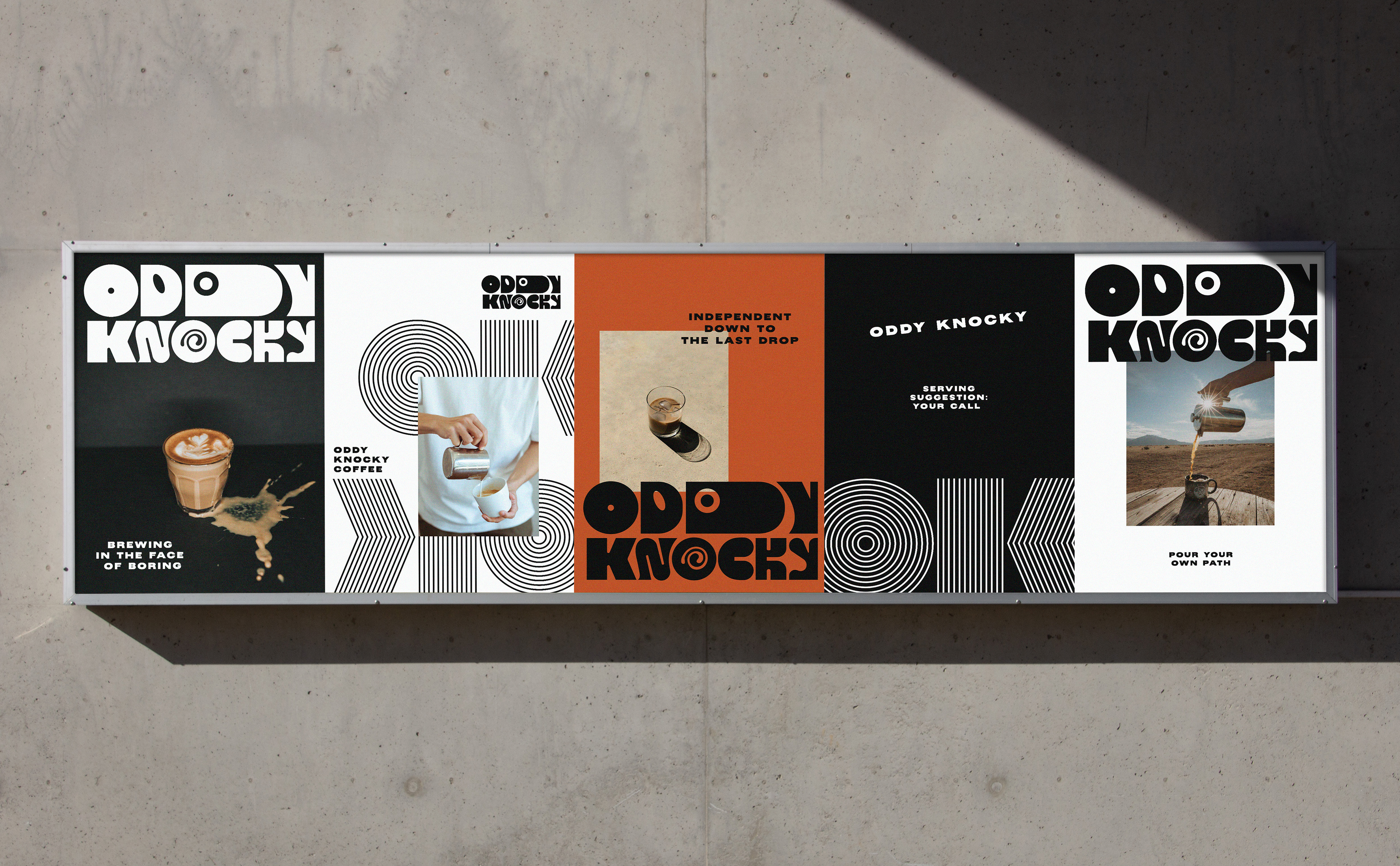
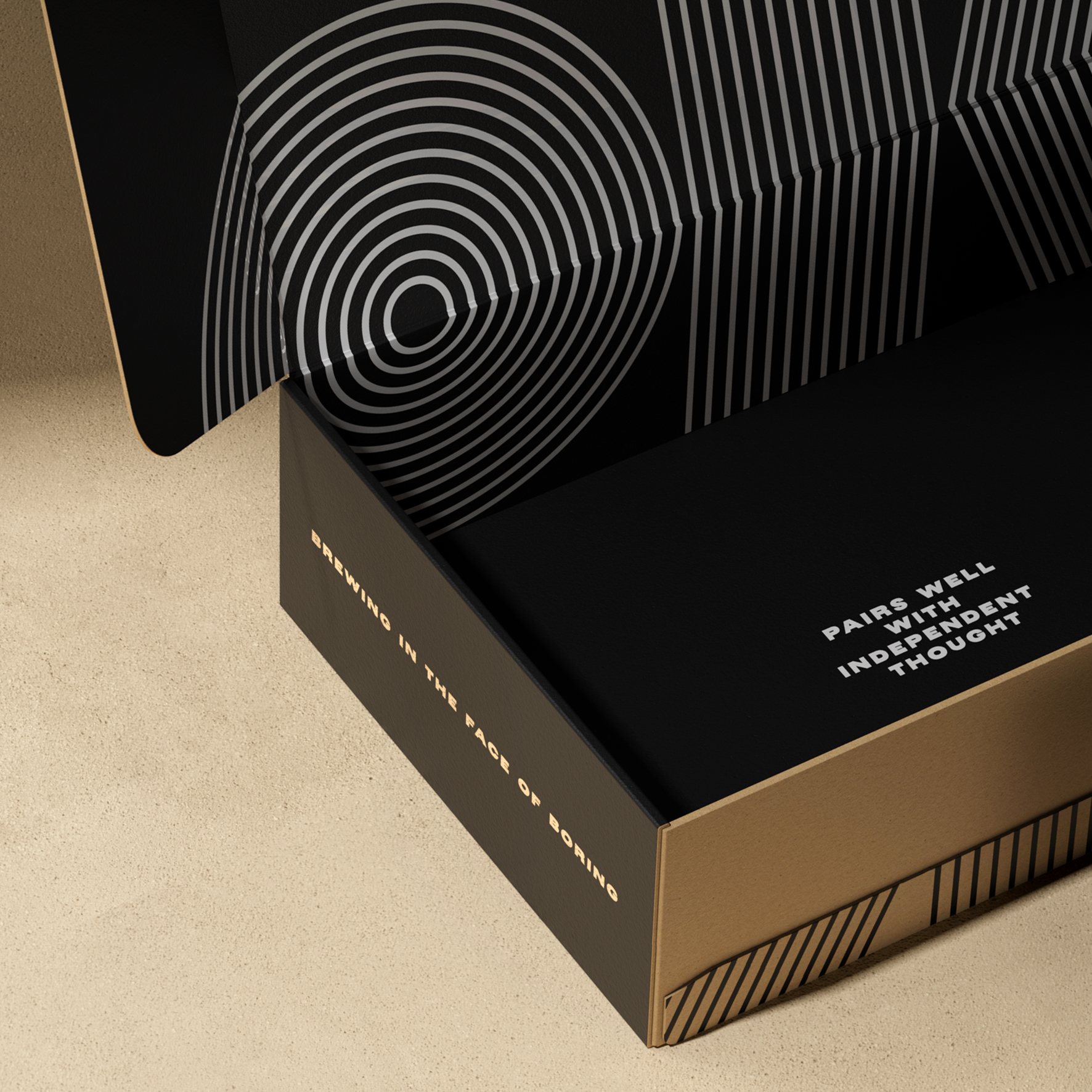
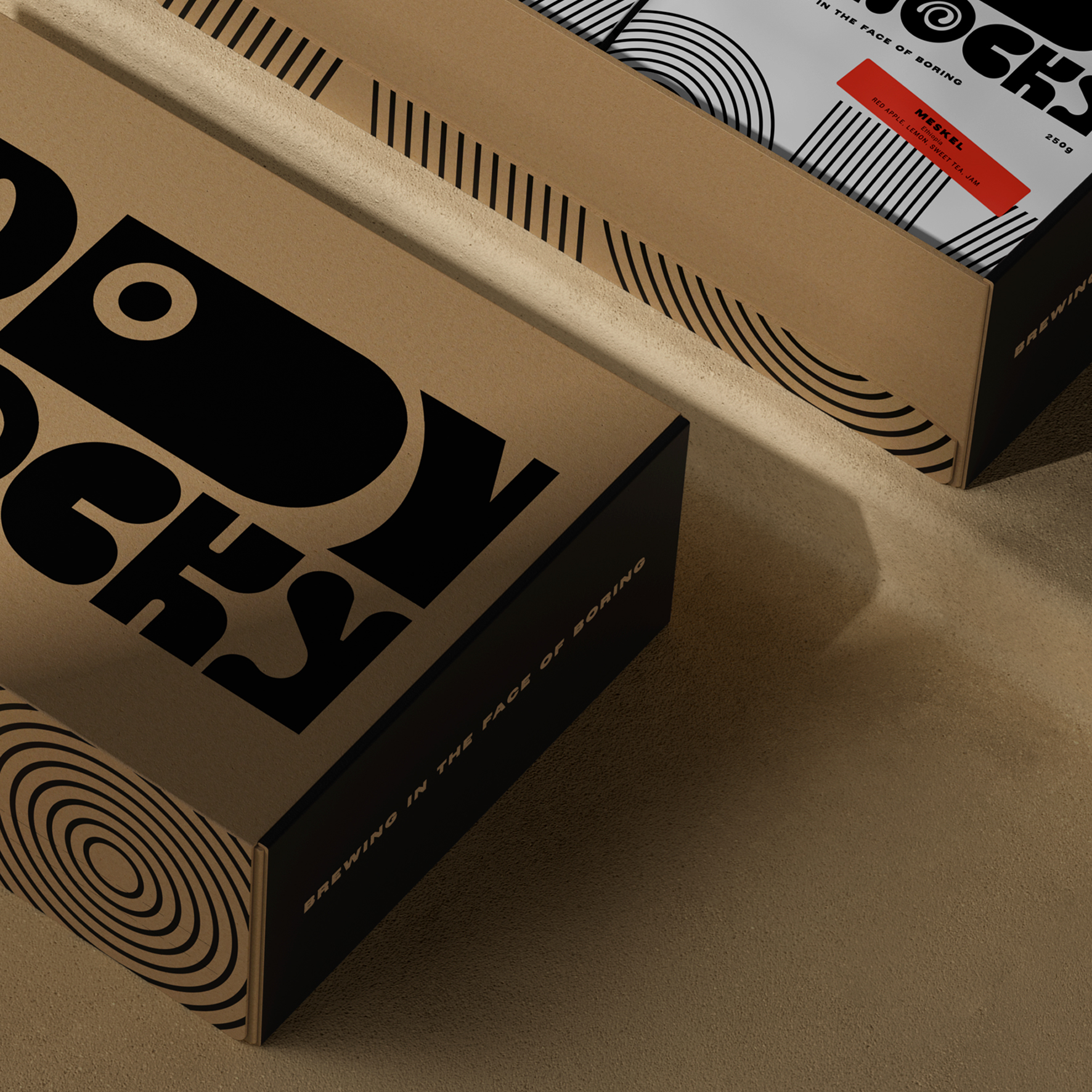
As well as conceiving the new brand name and identity, we designed the packaging (including the mailer boxes) and flowed the new identity through a new website as well as comms, serveware and merch. We’re proud to see Oddy Knocky going from strength to strength in the coffee world, making a splash at various festivals and events.
It tastes great too. Try it yourself here.
Sergeant Walnuts has been an invaluable partner. With Richard’s exquisite attention to detail, and Gary’s creative genius, they are a formidable force. Their exceptional guidance and leadership, coupled with their candour and straightforwardness, have been instrumental in the ongoing success of Oddy Knocky.
Matt Whitehead
Founder, Oddy Knocky
