DCYPHER
Visual Identity / Packaging / Brand Fundamentals / Comms
Reimagining a pioneering beauty brand
DCYPHER required a new brand identity to reflect their unique product offering: a mixed-to-measure liquid foundation.
Their make-up solution is rooted in complex technology (digitally scanning skin tone to create foundations matched exclusively to individuals) but their brand ID and packaging needed to look at home - and still standout - in the world of premium beauty. It was a tricky balance to strike, but strike it we did. And we’re proud to have played our part in DCYPHER’s continuing success.
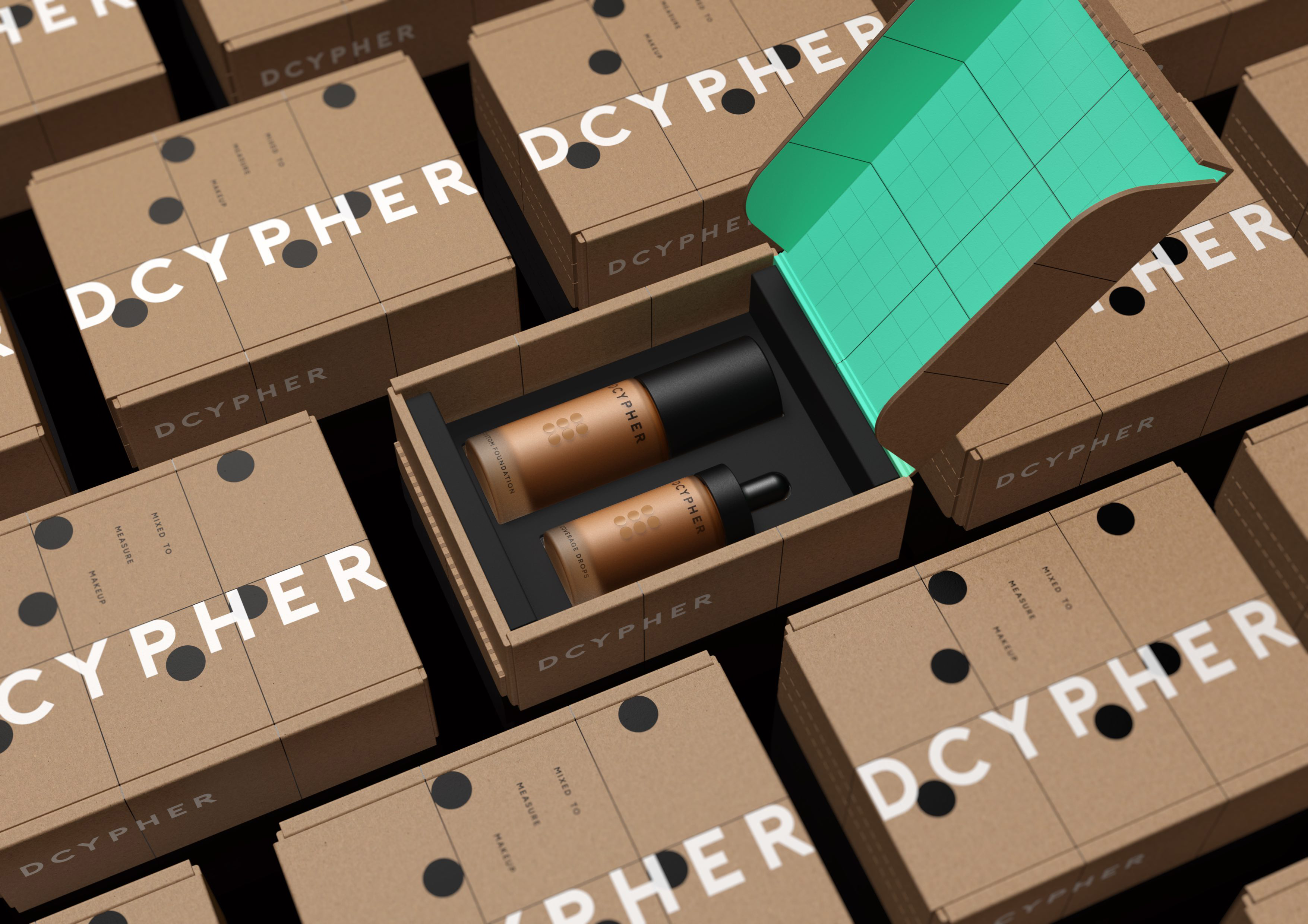
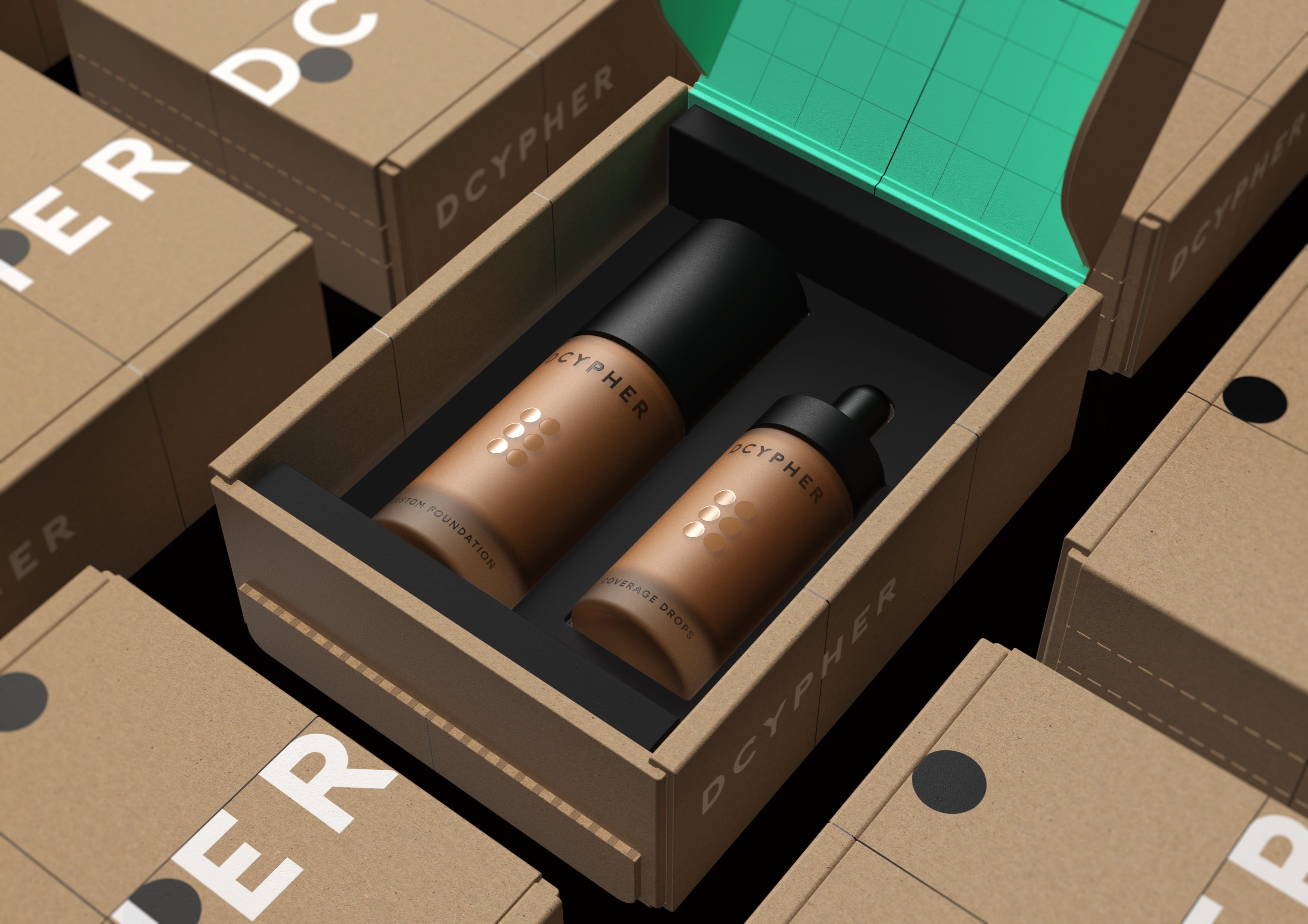
From Alan Turing’s Enigma Machine to Samuel Morse’s dots and dashes, the visual world of codes, cryptograms and ciphers is incredibly rich and interesting. So, we chose to amplify it as a visual language – celebrating the technical processes that help to put perfection in the palms of those who use DCYPHER.
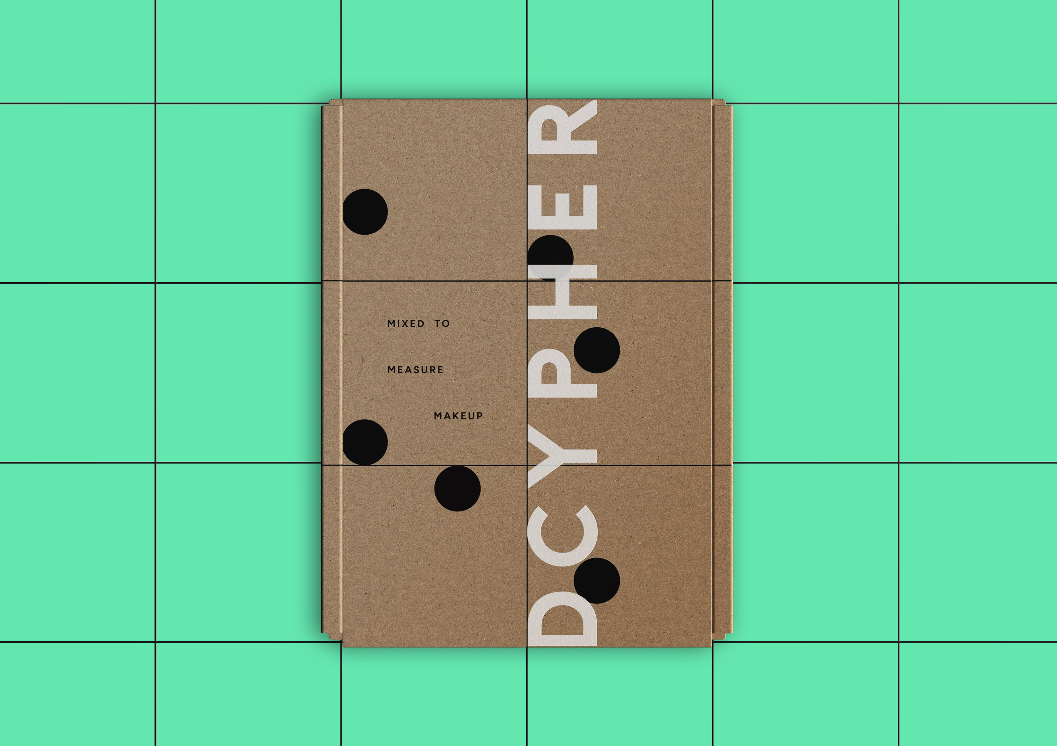
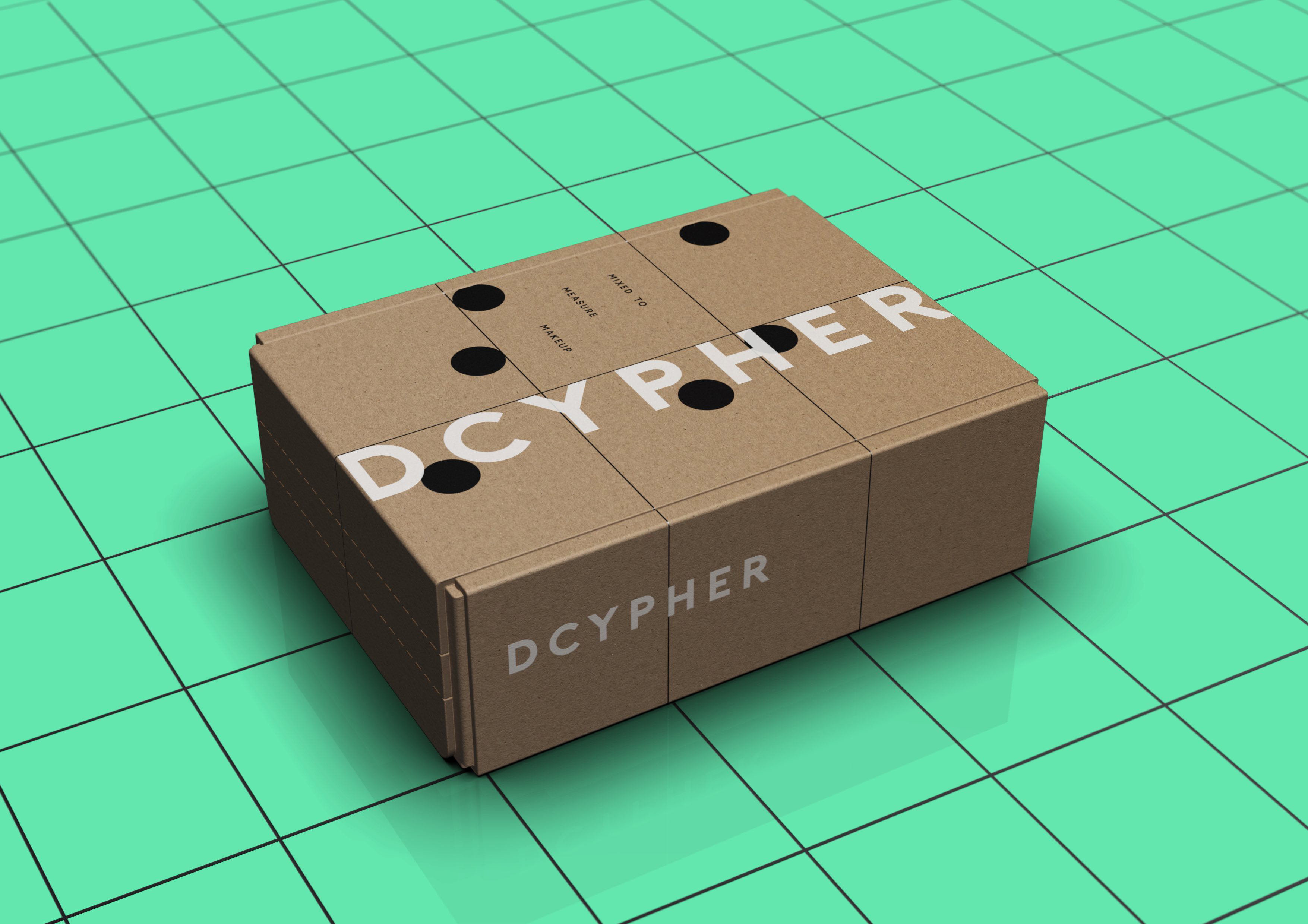
We were determined not to ‘dumb down’ the use of technology at the heart of DCYPHER’s offering. Many beauty brands assume that consumers are either unable, or unwilling, to digest complex information, and instead opt to go down well-trodden and often clichéd paths. We knew we were talking to an intelligent and curious consumer who’d see the technology for what it is – a genuine and valuable point of difference.
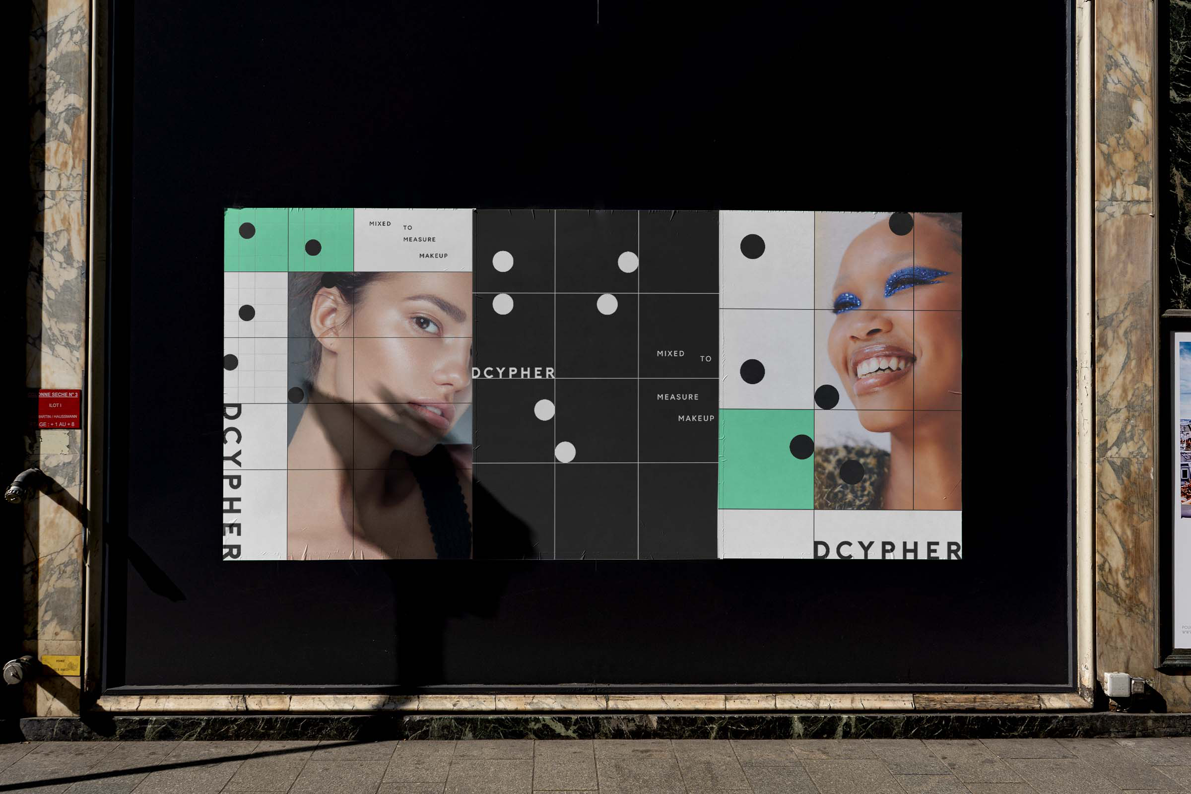
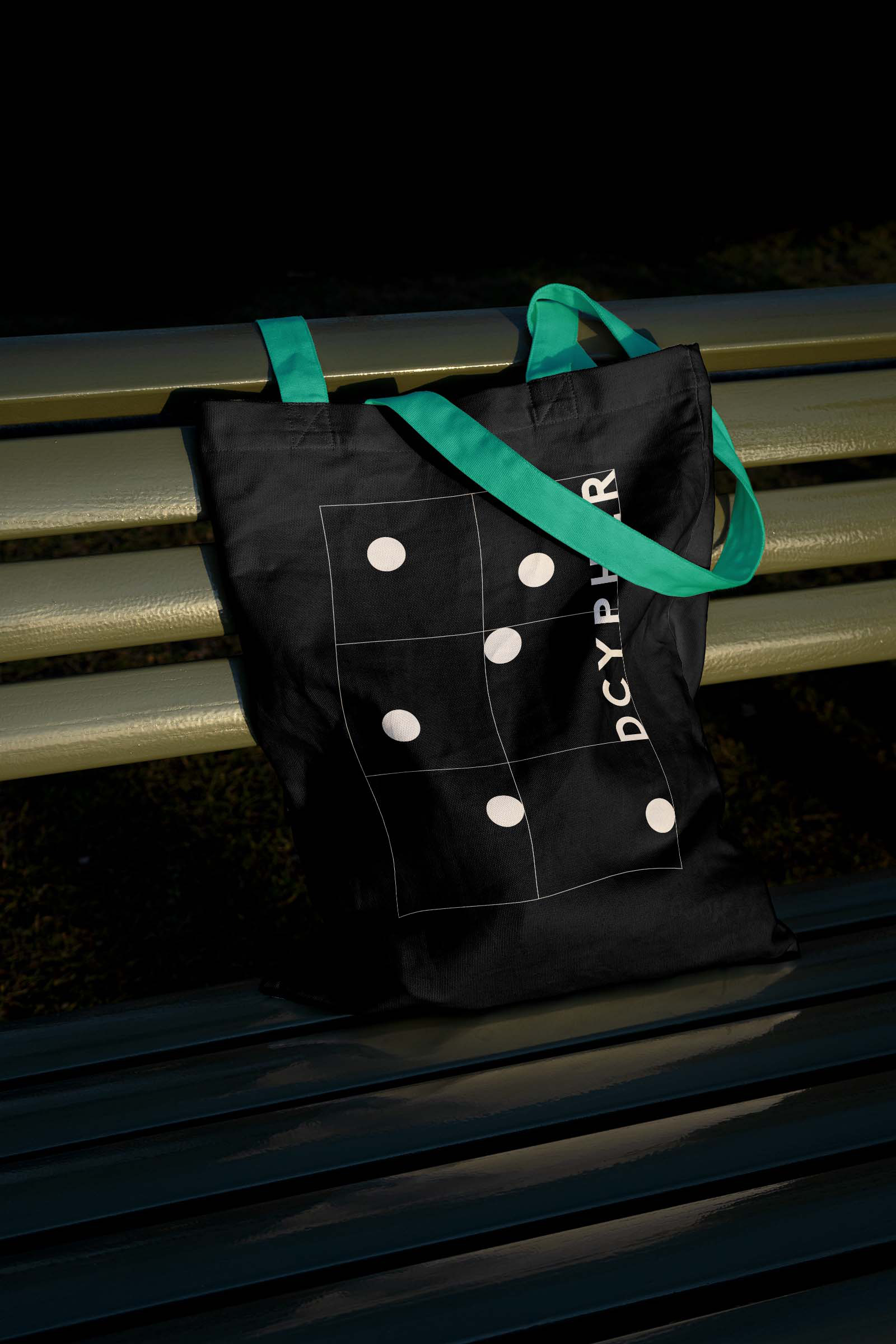
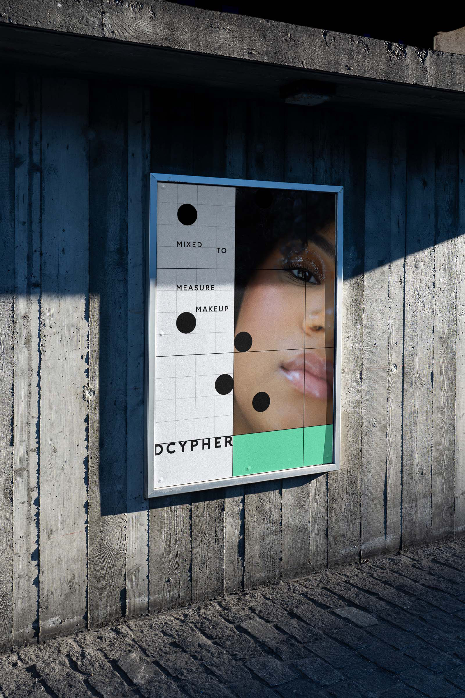
DCYPHER needed a system to work and flex across all touchpoints – brand identity, website, comms and, of course, that all-important ‘unboxing’ moment with some standout packaging. We were happy to oblige.
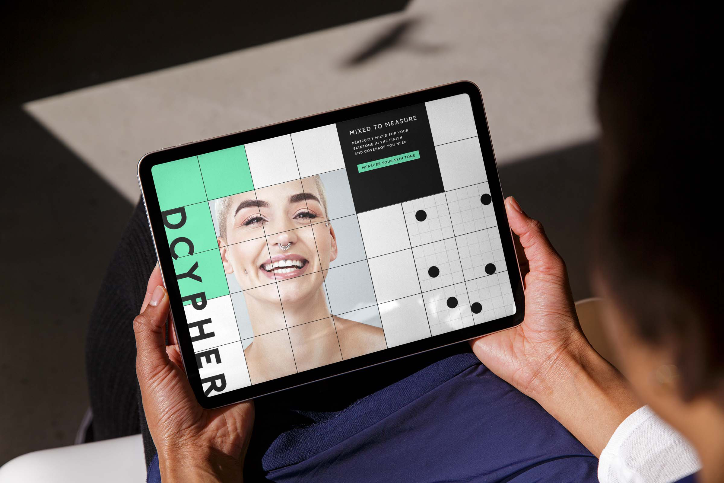
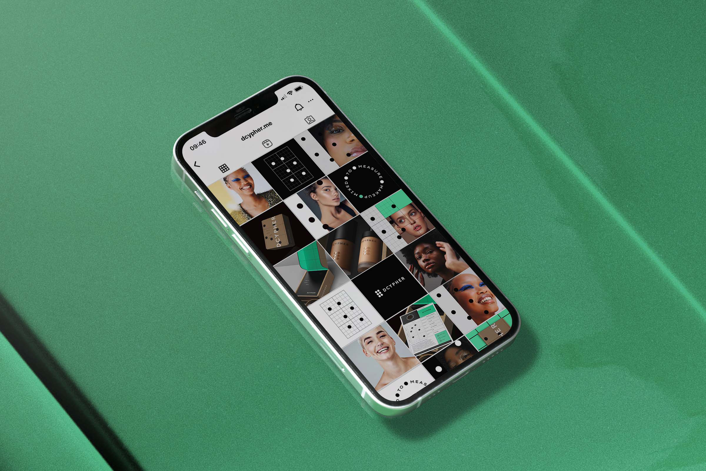
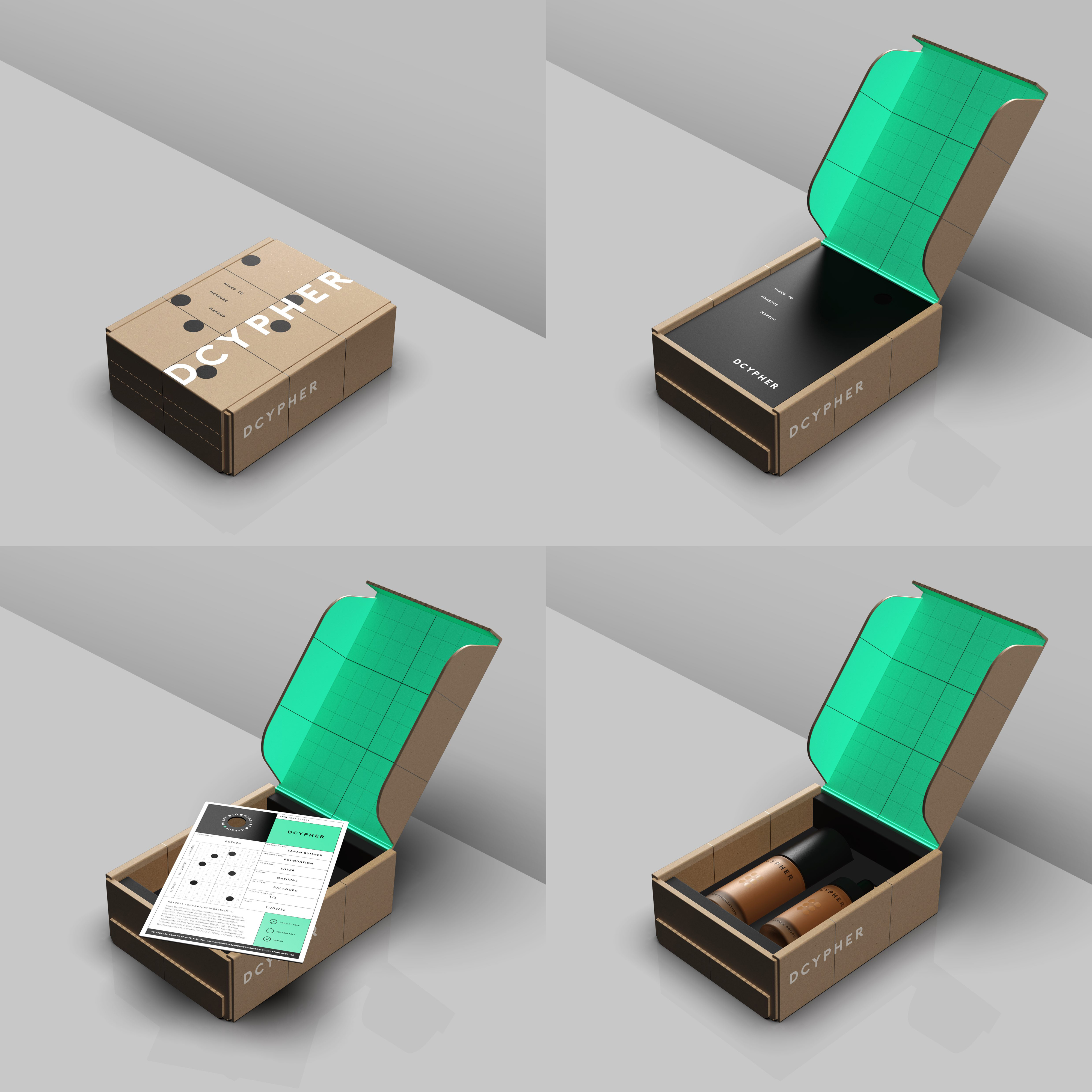
Working with Sergeant Walnuts was a genuine pleasure. We felt they immediately understood the complex processes that underpin our technology, and were able to bring it to life in a way that gives us a distinctive and flexible system to use across all of our consumer touchpoints. We’re really delighted with the end result.
Claire Triantis
Co-Founder, DCYPHER
